Designing Accessibility and
Donation Engagement
The Project
Over nine months, our team collaborated with the Gerber/Hart Library & Archives to redesign their website, supporting their mission to preserve and share LGBTQ+ history and culture. This partnership was initiated through our selection as one of DePaul University's top five IMPACT Grant recipients, which enabled us to focus on enhancing the site's usability, improving service visibility, and increasing donations.
Through comprehensive research, iterative design, and user testing, we identified user challenges on the existing site and developed targeted solutions. By the project's conclusion, we delivered a refined design and actionable recommendations, empowering the library to better serve its community.
My Roles
UX/UI Designer
Visual Designer
User Researcher
Communication Manager
Tools
Figma
Adobe Photoshop
Provenbyusers.com
WebAIM
Typewolf
WhatFont
Miro
Slack
Organization
Gerber/Hart Library & Archives
DePaul University
Project Dates
May 2024 - Jan 2025
In an effort to leverage technology for positive social impact, the Gerber/Hart Library partnered with a team of UX/UI design students from DePaul University to improve their website. The project was aimed at boosting user engagement, driving donations, and improving the visibility of their resources to better serve the LGBTQ+ community.
Collaborating with Gerber/Hart for Community Impact

Why Gerber/ Hart?
The Gerber/Hart Library & Archives has been a cornerstone of Chicago's queer community since the 80's, driving acceptance, inclusion, and justice through free access to LGBTQ+ media, archive collections, and community events.


[01]
Only 10% of Americans have received education about LGBTQ+ history in school.
[03]
Archives like Gerber/Hart preserve LGBTQ+ stories, ensuring their struggles and achievements are remembered.

[02]
Less than 50% of LGBT high school students and 20% of LGBT middle school students report having access to LGBTQ-related library resources.
[04]
Expanding access to Gerber/Hart educates future generations and fosters empathy.

How Does the Gerber/Hart Website Support the Community?
Gerber/Hart originally created a website to preserve and celebrate LGBTQ+ history. Now, they are collaborating with our team to enhance the platform, making it a more effective digital archive and resource hub for the community
Gerber/ Hart website features
Extensive Library Collection: Over 24,000 LGBTQ+ books, resources and 160 archival collection
Community Engagement: A hub for learning and celebrating LGBTQ+ identities, fostering connection.

Research Support: support for academic or personal research related to LGBTQ+ topics.
Educational Events and Exhibits: Regular programs fostering community engagement.
Gerber/ Hart Current Website
Gerber/Hart’s Question for Our Team
"How can we enhance our website to increase user engagement, encourage donations, and make our resources more accessible?"
- Erin Bell, Gerber/Hart Director

Our Approach and Process
[01]
Discover
While the Gerber Hart website aimed to serve the LGBTQ+ community, its navigation and content structure created barriers for users. Our research sought to uncover these pain points and identify opportunities for improvement.[02]
Define
We conducted UX research through a literature review, heuristic analysis, cognitive walkthrough, user interviews, and card sorting. These methods helped us define key issues with navigation, content clarity, and user engagement, guiding us toward actionable solutions.[03]
Design
We used our research insights to redesign the Gerber Hart website, starting with low-fidelity wireframes and refining them into high-fidelity prototypes. User testing guided iterations to improve usability and engagement.[04]
Deliver
At the end of the project, we compiled our research findings, design assets, and a style guide into a deliverable package. This was handed off to the Gerber Hart team along with development priorities and recommendations for next steps.Reviewing the Literature
To inform our design approach, we conducted a literature review focusing on increasing visibility, donations, and community engagement for non-profits, with a specific emphasis on LGBTQ+ organizations. We synthesized seven peer-reviewed papers and identified key themes that informed our strategy:
[01]
Importance of Branding and Recognition
Donors are influenced by brand recognition and positive perception.Aligning the mission with audience values boosts visibility and recall.Logos, taglines, and consistent visuals build trust and encourage donations.
[02]
Engagement through Online Communication
User-friendly, interactive, and action-focused websites boost engagement.Aligning organizational goals with design enhances impact.Clear calls to action and stakeholder-specific content sustain visitor interest and drive donations.
[03]
Motivational Factors for Donations
Donors are influenced by trust, good website design, and external incentives.Younger donors like to show their contributions, while older donors focus on trust and shared values.Tailoring donation messages to different reasons people give can help attract more donors.
Competitive Audit
https://docs.google.com/spreadsheets/d/1m8O7pkrrghH51mKwJnlmARKK4foJ6653/edit?gid=797423839#gid=797423839
Interviewing Users
USER INTERVIEWS: IDENTIFYING WEBSITE CHALLENGES
To enhance the Gerber/Hart Library's website, we conducted interviews with three participants, including library patrons and individuals from the LGBTQ+ community.Found the website's content confusing
Struggled with the donation dropdown menu
USERS WE INTERVIEWED


50%
Experienced confusion when searching for a specific archival collection67%
Feedback indicates that the GH website's layout is considered "clunky," with outdated design elements like purple bars.
Users appreciate online exhibits but desire more storytelling and up-to-date interfaces.
Participants experience confusion when searching for content, indicating a need for more prominent search options and better organization.
The homepage is perceived as unwelcoming, not modern, and lacking in engaging content.
The website's excessive text and lack of separation make it overwhelming.
[01]
[03]
[05]
Enhance navigation by adding a search bar and providing a brief introduction to guide users on website functionalities.
[02]
[04]
33%
ANALYZING INTERVIEW DATA
In our analysis, we transcribed interview recordings into text, coded the insights, and organized them into common themes using an affinity diagram. Interview Insights

[01]
Navigation Improvement: Users find it challenging to locate information on the website.
[02]
[03]
[04]
[05]
Donation Process: Users desire more options and a simpler way to donate.
Website Design: Users feel the website is outdated and not welcoming
Content Organization: Users are overwhelmed by too much text and find it hard to find specific information.
Event Presentation: Users want events to be featured more subtly, with clear information.
Interview Insights
Revisiting Gerber/Hart Structure
In our design phase, we began by focusing on improving the information architecture of the Gerber/Hart Library website. Using insights from our user research and conducting multiple rounds of card sorting activities, we developed a reorganized site structure to enhance usability and navigation.


REVISITING GERBER/HART STRUCTURE


ORIGINAL SITE MAP
END RESULT
CARD SORTING
We conducted hybrid card sorting sessions, both in-person and online, with participants who are members of the LGBTQ+ community or work closely with it, including those affiliated with Gerber/Hart. Participants organized topics into predefined categories and created their own, providing insights into user perspectives.PROCESS


RESULTS
Design Development


WIREFRAME SKETCHES
→
COLOR PALETTE.


→
TYPOGRAPHY & BUTTONS
LO-FI WIREFRAME
LO-FI WIREFRAME

Our team conducted a comprehensive web audit by reviewing the entire Gerber/Hart website to identify current issues in design, usability, and content. We combined these findings with insights from our card sorting sessions and user testing, allowing us to highlight key areas for improvement that align with user needs and design best practices.
[02]
Lo-fi Wireframe

WEB AUDIT
[01]
Web Audit
Using insights from card sorting and user testing, we created sketches for the homepage and donation pages to explore layout improvements. These sketches shaped our lo-fi wireframes, allowing us to test key design ideas before moving to mid-fidelity wireframes.
[03]
Mid-Fi Wireframe Development
Using insights from card sorting and user testing, we created sketches for the homepage and donation pages to explore layout improvements. These sketches shaped our lo-fi wireframes, allowing us to test key design ideas before moving to mid-fidelity wireframes.
A Glimpse of our Redesign
Overview
-
![]()
New Menu
Guided by our card sort exercise, we merged Events and Exhibits and removed buttons for a cleaner, more intuitive menu
-
![]()
New Homepage
The redesigned homepage improves navigation with a prominent search bar, upcoming events and exhibits at top with filter options, and clickable categories for archives, library, videos, and blogs
-
![]()
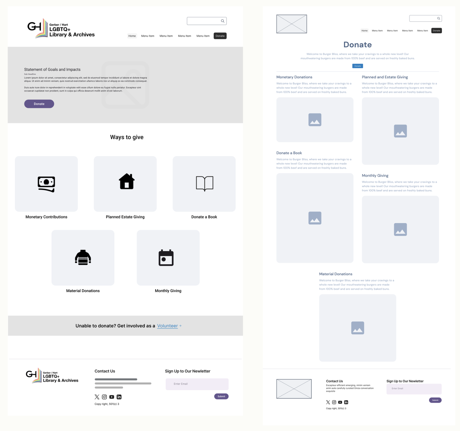
Donate Page
The new Donation page features an impact statement at the top and streamlined donation options for easier access
-
![]()
Navigation Bar - About
Card sorting led us to rename About Gerber/Hart to Mission & Vision, and move Sponsorship under Get Involved
-
![]()
Events & Exhibits Section
To simplify navigation, we combined Events & Exhibits, created list and calendar views for Events, and organized Exhibits into clear sections, all prominently displayed on the homepage
-
![]()
Get Involved Section
From our card sorting, we separated Support and Get Involved to reduce menu clutter. Users viewed Support as donations, so Get Involved now covers volunteering. We added a submenu for Donate and renamed Bookshop Wishlist to Donate a Book for clarity


BEFORE

AFTER

Gerber/Hart — Homepage Comparison
BEFORE

AFTER

Gerber/Hart — Library Catalog Comparison
BEFORE

AFTER

Gerber/Hart — Library Catalog Comparison
BEFORE

AFTER

Gerber/Hart — Donation Comparison
TESTING PROTOTYPE
We recruited 10 participants through UsabilityHub to try out our new prototype. After completing their assigned tasks, they were asked to fill out an optional survey based on their experience with the redesign

40% of participants found the new design better than expected for a library website
Most participants expressed interest in using Gerber/Hart Website after the redesign
Putting our Redesigns to the Test
[03]
[02]
[04]
[01]
9/10 participants found the new design clear and simple
Most participants expressed interest in using Gerber/Hart Website after the redesign